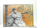
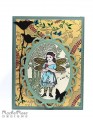
The BG for the focal image here was a Distress Paint resist tag I did for Summer of Creative Chemistry. I thought it came out too bland and light, so I stamped over it and cut it down, which just goes to show (once again) that you shouldn't ever throw something away because it didn't work out as you envisioned. The great and awesome Tim himself says that whenever he does something he doesn't like, he puts an X on the back and throws it into a box of "rejects", and he is constantly pulling stuff out of there and asking himself why he ever thought it was so bad in the first place.
Honestly, though, I think it would be pretty hard to make a bad card with this stamped image. It's pretty amazing IMO.
Date: Sunday, July 10, 2016 GMT Views: 232
Favorited:3
Splitcoast Dirty Dozen Alumni SCS Gallery Moderator Splitcoast Challenge Hostess Teapot Tuesday TEAm
Registered: July 27, 2007 Location: Dublin, Ireland Posts: 131397
Sun, Jul 10, 2016 @ 9:35 AM
That is a fabulous image - and the soft colours and design in your "reject" go so well behind her. I find most of my rejects get used in time, even if it's only for punching or die-cutting. It's amazing how cutting something up can improve it! And the texture of the mulberry behind it, and the way it picks up on the blue in the tag, is just fabulous.
Registered: March 31, 2008 Location: Eastlake, OH Posts: 22598
Sun, Jul 10, 2016 @ 11:35 AM
You choose the most fabulous images and compliment them so beautifully with your incredible layouts, Robin! Love that textured background you created! I too, have a box full of backgrounds with a big question mark on them. Many times the color just matches what I'm doing. Beautiful card!