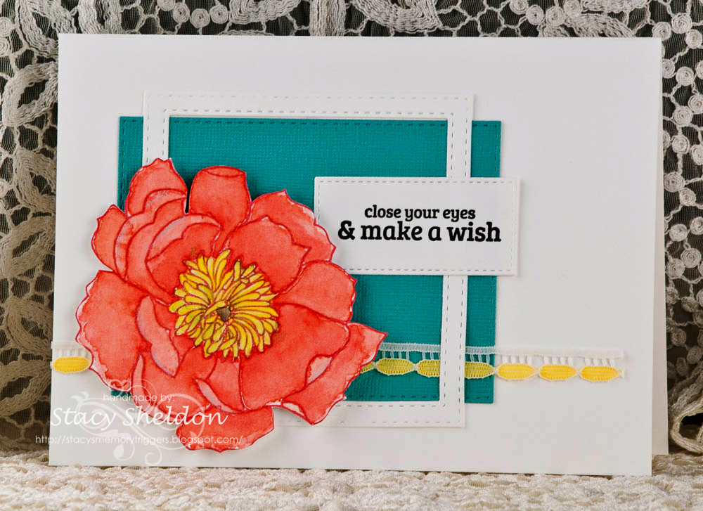
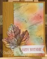
Well... what to say, the poppy was primarily colored with QoR watercolors and then the center has some prisma pencil and fineliner pen work in yellows over the stamens and the outer petals have some cloud blue prisma pencil on them. that is up on pop dots over the collage of diecut scraps and vintage lace.
Lydia, ( I never would have picked blue to be the third color for this flower and I really like how it POPS) so, thanks for this nudge, and tfl. There is a closer look at the bloom on the blog here if you are curious.
Date: Friday, March 4, 2016 GMT Views: 1798
Favorited:7
Splitcoast Dirty Dozen Alumni Favorites Team Notifier Splitcoast Challenge Hostess
Registered: October 26, 2009 Location: Oakhurst, near Yosemite Nat'l Park. Posts: 46755
Fri, Mar 04, 2016 @ 6:45 PM
Oh love that flower and your lace is beautiful as an accent!! Love the colors! Love the framing too! Wow, love everything!
PS, thank you sweet friend for your comments...you are such a good friend!
------------------------------ Blessings, Robin Encourage one anotherMy Blog-InkMagination , QFTD201,Dirty Dozen Alumni.Impression Obsession DT, DRS DT.Formerly HC DT, ODBD DT.
Registered: July 9, 2008 Location: Stars Fell on Alabama Posts: 74568
Fri, Mar 04, 2016 @ 7:27 PM
Stacy, this is a beauty. I love how that flower pops against the blue and the design is awesome. WOW!
------------------------------ My Blog---My Gallery---My PinterestI'm a Punchkateer! (Prez) FOREVERDirty Dozen Alumni2014 CAS Spring DT--- Inspiration Challenge Co- Hostess 12/02/17-12/28/19 Watercolor Wednesday Design Team Hebrews 13:2Brenda
Splitcoast Dirty Dozen Alumni SCS Gallery Moderator Splitcoast Challenge Hostess Teapot Tuesday TEAm
Registered: July 27, 2007 Location: Dublin, Ireland Posts: 131334
Fri, Mar 04, 2016 @ 11:54 PM
What a gorgeous flower! The blue really does make it pop, too, so yay for the challenge. I love the way you've used the white frame over the blue panel, too.
Thanks for seeing that my yellow spatters were pollen, that was indeed my thought process ;-).