Audrie gave us this amazing color site called https://designschool.canva.com/blog/...-combinations/
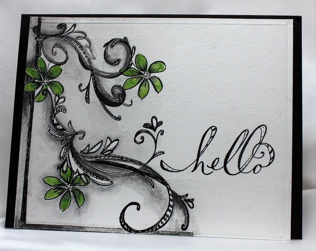
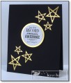
The color palettes were all inspiring, and very informative why they are eye appealing. I chose #92, because of the contrast of colors. Taking some very old flourish stamps and a single small flower stamped a design to look like the trendy zentangle. This is were the fun began....love to doodle...took a micron pen and added doodling to the flourishes. Then with the sketch pencils added the extra shading. Sketching with pencil is very forgiving with a good eraser. Some of these pencils are water coloring. Went over it all with a wet brush. Colored the flowers with the green for a pop of color. Stamped the sentiment, and did a little doodling. TFL
Date: Saturday, February 13, 2016 GMT Views: 1299
Favorited:11
Registered: November 7, 2006 Location: Willamette Valley Oregon Posts: 34498
Sat, Feb 13, 2016 @ 9:04 AM
Oh, I am drooling over here! I immediately thought of my old yellowing, in the bottom of a box of more loved stamps flourishes. You create a marvelous card for the IC and encouraged me to dig said flourishes out. And so thank you, Linda, for inspiring me with your Inspiration! Love the sense of play here...I need practice.
------------------------------ Susan~~~One4Joydaily I'm a FAN CLUB member, U? MY GALLERYof visual Delights MY BLOG
Registered: December 16, 2008 Location: Woodinville, Washington Posts: 11566
Sat, Feb 13, 2016 @ 12:44 PM
WOW WOW WOW - I stared at this for a long time trying to figure out what I loved the most about this! You definitely captured the color palette wonderfully, but the reality is that 'you're a doodler after my own heart'! I'm crazy about this because of your shadows and your doodling and your stamped sentiment fits perfectly and looks "hand penned"! Inspiration genius and my fav!