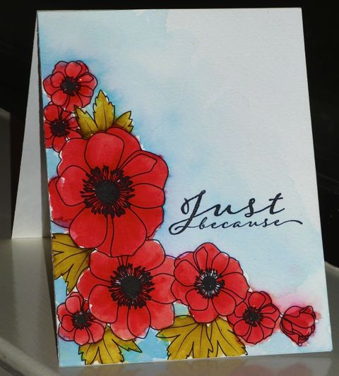
For CC569 - Watermelon Wonder, Lost Lagoon and Old Olive. I used Distress markers and the flowers look more red than "watermelon" color in the photo than in real life.
Date: Monday, February 8, 2016 GMT Views: 1402
Favorited:7
Splitcoast Dirty Dozen Splitcoast Challenge Hostess Proud Fan Club Member
Registered: September 24, 2007 Location: WA Posts: 13991
Mon, Feb 08, 2016 @ 10:25 PM
Harriet, I love the red flowers (close enough to Watermelon) and leaves against the blue background. Your coloring with the markers is wonderful! Such a pretty card!
------------------------------ Barbara Splitcoast Dirty Dozen My website: Inky Fun SCS Fan Club Member Color Challenge Team Member QFTD215
The watermelon really does show through on your poppies! Your card is simply gorgeous! I just looked at what kind of paper you used and I am intrigued, I am going to check that out. Beautiful card!
Registered: October 30, 2007 Location: Posts: 26718
Tue, Feb 09, 2016 @ 5:34 AM
Just beautiful, Harriet! I was so tempted to buy those preprinted papers from PTI, and now you are making me regret my decision to pass!!! Love your card!