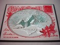
It took a couple of tries to use the CC556 colors and make it come out like I had in mind. The turquoise is very light and there is only a little of the primrose petals on the holly leaves. But the colors are there. I added the neutrals of white and gray to the color palette.
Date: Thursday, November 12, 2015 GMT Views: 1358
Favorited:2
Splitcoast Dirty Dozen Alumni SCS Gallery Moderator Splitcoast Challenge Hostess Teapot Tuesday TEAm
Registered: July 27, 2007 Location: Dublin, Ireland Posts: 132007
Thu, Nov 12, 2015 @ 12:36 PM
What an amazing snowy effect, Pat! I think you got the colours to work perfectly - but I can never wrap my head around primose petal being pink. I'm sure you're familiar with the pale yellow wild ones which are what everybody here thinks of as primrose! I really like the added dimension to the holly leaves.
Splitcoast Dirty Dozen Creative Crew SU Design Team Alumni
Registered: May 18, 2004 Location: Southwest Michigan Posts: 37113
Thu, Nov 12, 2015 @ 12:41 PM
I love the serene and peaceful scene on your Christmas postcard. Love the sparkly, icy trees and snow, and way to go getting those challenge colors in there!
------------------------------ Claudia Splitcoast Fan Club Member
Registered: February 5, 2007 Location: St. Louis, MO Posts: 92636
Thu, Nov 12, 2015 @ 12:59 PM
Pat, you did a fabulous card to combine the two challenges on this lovely Christmas card. The red on the bg makes a wonderful statement and you colored and frosted the scene so beautifully.