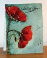
I posted the card on the right for the CAS335 challenge on Monday. I thought I would re do the card this time using a silk coated card stock, the one on the left.
You can see with water colour paper the bister powder as soon as the water hits it the colour is pulled into the paper, the colours are much darker and also seep between the embossed image making it stand out much better.
The coated card lets the ink coloured water run over giving a much softer look and less colour gets between the embossed image, still very pretty but much more subtle.
Having done this little experiment, I think I prefer water colour paper for embossed images and the coated paper for ranger archival or stazon ink. Let me know what you think
Date: Thursday, July 30, 2015 GMT Views: 925
Favorited:3
Registered: March 31, 2008 Location: Eastlake, OH Posts: 22598
Thu, Jul 30, 2015 @ 8:31 PM
Silk coated cardstock? Christine, I've learned more about paper from you than anyone, ever! What a difference! The vibrancy is amazing. I love that you let them flow on their own too. Beautifully done!
Registered: June 13, 2008 Location: Vancouver, Canada Posts: 23750
Thu, Jul 30, 2015 @ 8:50 PM
Great experiment to show the difference! I love the card on the right, while the one of the left would definitely work better with a dark ink. It's so interesting to see the different effect you get with the different papers.
------------------------------ Susan
My SCS gallery is here should you care to look! Or please visit my blog, Cardmaker's Garret.
Registered: June 4, 2009 Location: Deatsville, Alabama Posts: 83609
Mon, Aug 03, 2015 @ 4:06 AM
Very cool experiment - TFS!!! I like them both but I like the watercolor one the best (just a tiny bit more though). Great idea for this set too. Hugz
------------------------------ Nancy Williams - Hope your day is Spirit-filled and ink-filled (in that order)!DRS Designs-DT, Punchkateerforever, Dirty Dozen Alumni