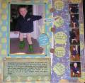
This is a layout I did of my two year son. It was the first time he put his boots (or any clothing item) on himself. He was adorable parading around in his frog boots and his diaper (he had also taken off his pants...). I wanted to include the sequence of photos that showed him working to get them on, but the pictures didn't turn out great. So, I made them all small and created a little film strip-like sequence down the right side. I wish the title stood out better. The white lettering of "independence" doesn't show up that well - so if anyone has any suggestions, I'd love to hear them!
Date: Monday, April 17, 2006 GMT Views: 601
Favorited:2
Registered: July 14, 2004 Location: Texas Posts: 5513
Mon, Apr 17, 2006 @ 11:04 AM
This is adorable. Great pictures and great layout. My only suggestion would be to overlay the letters with something you have that you can stamp and that would be more bold...or could you take a white gel pen and trace over what is already here and just make it more pronounced!?! Thanks for sharing. I'd love to see what you decide to do if anything.
Registered: November 14, 2004 Location: On the beautiful Ohio River Posts: 3989
Mon, Apr 17, 2006 @ 11:46 AM
This is sooooo cute! I love your papers, the 'sequence' of pictures, and your adorable little boy!! Maybe stamp the letters on little triangles and/or circles that pick up the BG??? Love it just the way it is, too.... TFS
Registered: May 24, 2005 Location: Behind the Lens of a Cannon 40D Posts: 20038
Fri, Apr 21, 2006 @ 2:54 PM
This is sooo adorable! How about mounting the title onto cardstock and trimming around it or cutting it out in circle shapes for a more bold or sounds out look!