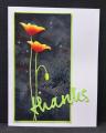
You will notice I left the ribbon/bow off from my card. Two reasons: I consider it embellishment and therefore, not the "bones" of the design. Also nothing makes a card look sadder after it has been through USPS's regular mail than a smashed and bedraggled bow....I leave them off cards that I send at std postage.
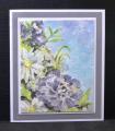
This Hero image lays down the bg...not the detail of the image. I wanted it REALLY dark so I stamped with black acrylic paint...... then colored the image that was left with watercolors, giving the roses their petaled look. I also cut the oval(#4 panel) out of panel #2 rather than adding another piece of CS.
TFL
Date: Wednesday, March 18, 2015 GMT Views: 1961
Favorited:12
Registered: May 23, 2009 Location: sunny california Posts: 9825
Wed, Mar 18, 2015 @ 5:55 AM
What a striking card, Sallie. So cleaver to use black acrylic to get that really dark bg... I never use those types of stamps because I can never get the ink to cover the bg. You did a wonderful job painting the roses and I like the cut out oval. Just beautiful.
Registered: June 29, 2004 Location: Sugar Land. Texas Posts: 79473
Wed, Mar 18, 2015 @ 5:56 AM
I left the ribbon off mine as well. Love this pretty card.
------------------------------ LizThe joy of the LORD is my strength.Right Brain Madness --My blogProud member of the redDivasKSS certified multi-step stamperFan Club member since 2004
Registered: December 15, 2011 Location: Abilene TX Posts: 11275
Wed, Mar 18, 2015 @ 6:18 AM
Stunning! And I love the black acrylic paint - it's almost impossible for me to achieve a beautiful black background on my reverse stamps, so thanks for sharing that little tidbit. The roses look so amazing - so gorgeous against the background!
------------------------------ JodyLynn - "Love me - love my cats!" DTGD12, DTGD14, HYCCT12, HYCCT13, HYCCT14, HYCCT15, Love Fest 2013, Love Fest 2014 CAS and CC guest designer QFTD 258
Registered: January 20, 2010 Location: Brampton, Ontario Posts: 26123
Wed, Mar 18, 2015 @ 6:57 AM
Beautiful Sallie! Your stamped panel looks like a piece of fabric my mom may have used eons ago. I really like the way you adapted the sketch to reduce the card's profile. I mail most of my cards and am always concerned about the more fragile ones making it unscathed.
Registered: July 20, 2007 Location: Fergus, Ontario, Canada Posts: 52523
Wed, Mar 18, 2015 @ 6:58 AM
Wow! Those roses are gorgeous! The way you coloured them to show the petals is marvellous. Thanks for the tip on using black acrylic paint to get a really black stamping. Ink just doesn't seem to do it for me either.
------------------------------ Ina
"Surely His salvation is near those who fear Him, that His glory may dwell in our land." Psalm 85:9
Registered: March 31, 2008 Location: Eastlake, OH Posts: 22598
Wed, Mar 18, 2015 @ 7:15 AM
Wow, I have a few negative stamps like this but would never have thought to use it this way! Brilliant idea to stamp in paint, another unique idea! Love those roses and the gorgeous shading. Your layout is wonderful, Sallie and love the way you added your sentiment in the negative space. GORGEOUS!
Splitcoast Dirty Dozen Creative Crew SU Design Team Alumni
Registered: May 18, 2004 Location: Southwest Michigan Posts: 36983
Wed, Mar 18, 2015 @ 7:26 AM
I love those Hero Arts stamps that put in the background and allow you to color the image - this one is particularly pretty - so realistic, and your coloring/shading is stunning as always. Love the way you punched out the oval showing the stamped greeting behind.
------------------------------ Claudia Splitcoast Fan Club Member
Registered: June 13, 2008 Location: Vancouver, Canada Posts: 23665
Wed, Mar 18, 2015 @ 8:18 AM
Love the dark black you achieved with the acrylic paint stamping - I must try that. Your roses are beautifully painted. And the grey corrugated background is so unique - love it.
------------------------------ Susan
My SCS gallery is here should you care to look! Or please visit my blog, Cardmaker's Garret.