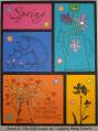
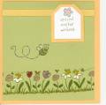
The linen is stamped on white naturals, then burst into bloom is stamped on top of that.
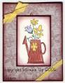
I tried the burgundy grosgrain with this and it doesn't match at all... so I went with apricot... like some of the flowers. But I don't really like the apricot grosgrain on here either.
Any suggestions??? I almost didn't post this one... but thought maybe some of you could give me some good pointers.
Date: Tuesday, April 11, 2006 GMT Views: 643
Favorited:7
Registered: April 19, 2004 Location: pineapple under the sea! Posts: 54165
Tue, Apr 11, 2006 @ 1:02 AM
I really like the apricot ribbon with this. Maybe if the background was more solid (like tone on tone) it would make the focal image stand out more? That's all I can think of, I still really like this.
Minglerville Blabber Creative Crew SU Design Team Alumni
Registered: August 14, 2004 Location: Posts: 98098
Tue, Apr 11, 2006 @ 4:52 AM
I just love it!
------------------------------ Debra the Debrameister Nagigator Mingler Gallery My Blog: Yellow and Blue SU Creative Crew Design Team Member-May-August 2011


 I almost didn't post this one... but thought maybe some of you could give me some good pointers.