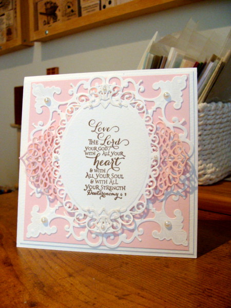
The first image on the page was the most inspiring to me, with the vines and flower buds that seemed to be growing outward from the color palette.
So I decided to stick to just pink and white, but have it all seem to radiate out from the center focal piece. I had planned to make this a "welcome baby girl" card (typical for pink) but my hand just would not let go of the Verse stamp!
I hope you join us for this weeks inspiration challenge, there are more than enough color palettes to go around! It's loads of fun!
BIG HUGS,
Audrie
Date: Friday, August 15, 2014 GMT Views: 3152
Favorited:4
Registered: March 31, 2008 Location: Eastlake, OH Posts: 22598
Fri, Aug 15, 2014 @ 8:33 PM
Audrie, the lacy layers of frames are SO perfect for this beautiful verse! So glad you stayed with it instead of a baby card. My goodness, this is absolutely gorgeous! Love the pink and white. The elegance of the card is so suitable for your sentiment. I love it!
Splitcoast Dirty Dozen Alumni SCS Gallery Moderator Splitcoast Challenge Hostess Teapot Tuesday TEAm
Registered: July 27, 2007 Location: Dublin, Ireland Posts: 131397
Sat, Aug 16, 2014 @ 4:43 AM
You really captured the feel of the image as well as the colour palette with that beautiful layered die-cut setting. The elaborate font of the Scripture pairs perfectly with the die-cuts.
Registered: August 7, 2007 Location: North Carolina Posts: 28113
Sat, Aug 16, 2014 @ 10:16 AM
Simply stunning!!! LOVE this verse, and how you layered your beautiful die cuts!!!
------------------------------ MY GALLERY My BLOG
No card is complete without at least one cat hair
DT: Our Daily Bread designs
Happily a Fan Club Member Romans 6:23