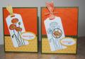
The Challenge: DSP/Color Focus: Lightest to Darkest, but try to use the provided sketch.
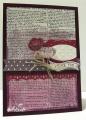
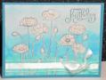
I have produced a shabby chic / vintage card using the sketch provided with Blackberry Bliss, Rich Razzleberrry and Perfect Plum inks. To create a monochromatic look, I scribbled these inks onto a large acrylic block, misted the block with water and pressed on a piece of Whisper White. This was then dried with the heat gun, stamped with Dictionary in Memento Tuxedo Black ink, and layered onto a base of Blackberry Bliss card stock. Rich Razzleberry was used to cut a Finishing Touches Edgelit lace edge. Perfect Plum DSP was cut into a banner end using the Banner punch. The Decorative Label Punch was the shape for another piece of Rich Razzleberry, and the Large Oval Punch for a piece of Whisper White. These two pieces were adhered together and embossed with the Perfect Polka Dots TIEF. I coloured a couple of Poppies, one with Razzleberry Blendabillities and the other with Perfect Plum ink and a Blender Pen. The flowers were fussy cut and added to the card with dimensionals. Linen thread provided the double bow, and the sentiment is from Itty Bitty Banners, cut with the matching Bitty Banners Framelit.
Registered: July 16, 2004 Location: Hager City, WI Posts: 664
Sat, Jun 28, 2014 @ 6:22 PM
The romance of this project comes through in the deep and muted colors. You are quite inventive to use the block and misting to create the ombre color palate. I also like the way the polka dots on the DSP mirror the textured dots on the curly label.