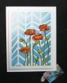
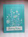
I embossed the stamps in white and then blended the inks over them with the daubers. Then I rubbed off the ink that had stayed on the embossing to whiten it up. Added some light pool and daffodil splatters with the Distress marker spritzer (which leaves the fine splatters), and then some slightly bigger splats with a technique I learned from Loll Thompson's blog: dip a paintbrush in a mix of a few drops of reinker diluted with some water and then carefully flick some drops onto your cs. Thanks, Loll!
Lastly, I sprayed the whole main panel with sparkle glimmer mist. Oh, my gosh, this made the whole panel soft, lovely and sparkly. Love what it added to the card, but of course you can't see it in the photo! Trust me, it's sparkly.
Registered: May 23, 2003 Location: Ontario, Oregon Posts: 9431
Sat, Apr 05, 2014 @ 8:06 PM
You're on a roll! Classy looking card; I definitely like the crisp white embossed images contrast with the sponging. And your speckles are spectacular - love those big splotches, especially. The glimmer mist does add a lovely, soft richness IRL that is next to impossible to capture in a photo. Cool looking card! TFS
Registered: February 1, 2005 Location: Temple, Tx Posts: 37720
Sun, Apr 06, 2014 @ 1:42 PM
This is beautiful, Sue...what a great way to highlight all the CTD colors!!! The white embossed images are really pretty and I love all the sponging and spatters!!!! Thanks for playing along with us at the Color Throwdown Challenge!!!!