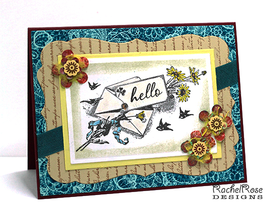
I started this project by stamping the focal image and asking myself what the heck I was going to do with it. I originally bought it because I love it, but it's so delicate in feel that I wasn't sure how to work with it. Selective coloring with Distress markers was the answer, with some DI sponging around the edge of the die. Having that "hello" stamp, which fit perfectly in the space and was just the right style of type, was a lucky break.
The flowers are something I have been playing around with this week. I got the idea from this tutorial:
and these are the first three I made. (I had to collect some flower punches first... for some reason my bright ideas always seem to involve shopping to bring to fruition.)
It was fun building this card, color wise. I can see now that the flowers ended up tying together what is actually kind of an offbeat combo.
Then there was the tilt debate. I like to tilt stuff on my cards, and in the first layout the Nestie shape and the focal image and the ribbon were all tilted various ways, and then just the ribbon and the focal image, and in the end only the ribbon. Everyone who entered my house yesterday got pressed into service for that decision. I'm happy with what I ended up doing. This card had enough going on without all the tilting.
Thanks for looking!
Date: Saturday, January 4, 2014 GMT Views: 824
Favorited:2
Additional Info
Stamps: 100 Proof Press Birds and Flowers Letter, "hello" stamp from PTI, Rubbernecker French Script BG, IO CAC BG stamp in Rose Lace
Paper: PTI Crimson Jewel for base, PTI Fine Linen and Aqua Mist
Ink: Colorbox Fluid Chalk in Chestnut Roan, Adirondack Dye in Stream, Various Distress Inks and markers
Registered: December 15, 2011 Location: Abilene TX Posts: 11275
Sat, Jan 04, 2014 @ 3:16 PM
Love this card! The image is beautiful, and the selective coloring is perfect! Now I'm off to check out that tutorial!
------------------------------ JodyLynn - "Love me - love my cats!" DTGD12, DTGD14, HYCCT12, HYCCT13, HYCCT14, HYCCT15, Love Fest 2013, Love Fest 2014 CAS and CC guest designer QFTD 258
Registered: September 20, 2006 Location: Sarnia, Ontario, Canada Posts: 3734
Sun, Jan 05, 2014 @ 4:00 PM
Lovely card. Like you, I like this image. Your turquoise background brightens things up nicely. Love your flowers. TFS the tutorial. You did an excellent job.
Splitcoast Dirty Dozen Alumni SCS Gallery Moderator Splitcoast Challenge Hostess Teapot Tuesday TEAm
Registered: July 27, 2007 Location: Dublin, Ireland Posts: 131448
Sun, Jan 12, 2014 @ 2:18 AM
I always forget about only having to colour part of an image and how effective that is! Just the ribbon tilted is perfect for me - it carries the letter on its flight (well, the little birds make me think the letter is flying along!).
I love flower punches - I was looking through mine trying to weed a few out (ha ha) for a bag of craft supplies I'm planning to FreeCycle, but in the end I held onto them all.
Oh yes - I'll always ask DH's opinion if I'm not sure about something. Even if I don't go with his suggestion in the end (usually do, though) I think it helps clarify our own thoughts by asking someone else.
Splitcoast Dirty Dozen Alumni SCS Gallery Moderator Splitcoast Challenge Hostess Teapot Tuesday TEAm
Registered: July 27, 2007 Location: Dublin, Ireland Posts: 131448
Wed, May 24, 2017 @ 11:12 AM
Thank you so much, Robin! As always, cards are lovelier in the hand than on screen. There's something so tactile about this with all the layers and especially the dimensional flowers.