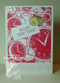
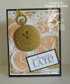
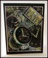
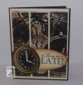
Ok, I mentioned on my other mix28 cards about my ugly watch card... well here it is. I actually like how it turned out. I thought it was way too busy how I first had it so I eliminated a couple of panels. I have the little pocket watch popped up on a paper spring. I wanted it to look different from the background (which was another reason I thought it was ugly at first... it blended in too much) I cut a piece of acetate to fit the watch face. I added a brad and a black cardstock ring to hold the acetate in place. I used two new sets that will be released next week during Mark's Finest Papers August blog hop. I used POCKET WATCHES and TAKE TIME.
Date: Friday, August 9, 2013 GMT Views: 746
Favorited:3
Registered: May 10, 2006 Location: Westminster, CO Posts: 27896
Fri, Aug 09, 2013 @ 4:26 PM
It turned out perfectly! Quite similar to mine from yesterday....minus the blowing of the ink! And you just know this Navajo word? Random or do you speak it? Love the stitching, too.
------------------------------ Be the reason someone smiles today!
Registered: March 31, 2008 Location: Eastlake, OH Posts: 22598
Fri, Aug 09, 2013 @ 5:36 PM
I think this stamp is tops on my wish list after seeing this! Love the newsprint in the background as well as the wonderful application of color. I love seeing your cards!
Registered: December 15, 2011 Location: Abilene TX Posts: 11275
Sun, Aug 11, 2013 @ 7:01 PM
I love this! Don't know what it looked like when you hated it, but this is fantastic!
------------------------------ JodyLynn - "Love me - love my cats!" DTGD12, DTGD14, HYCCT12, HYCCT13, HYCCT14, HYCCT15, Love Fest 2013, Love Fest 2014 CAS and CC guest designer QFTD 258