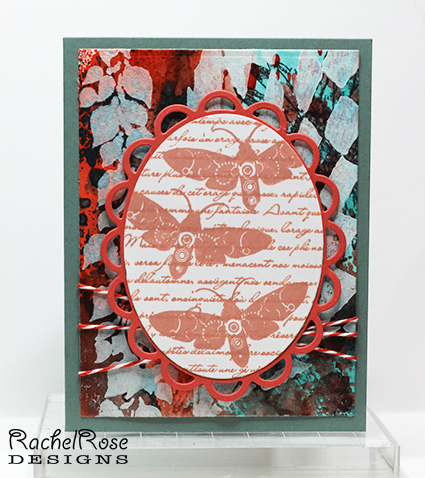
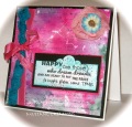
This is for Mixability Challenge 21 - Brilliant Pastels. Our mission this week was to create a brilliantly colored BG using mediums of our choice, and then tone the BG down using any white medium. I did a wrinkle free distress piece in Ripe Persimmon and Peacock Feathers, using a piece of WC paper that already had a bunch of stuff stamped on it (in other words, a reject). If you look in the upper right hand corner you can see some of that, part of my Paper Artsy Daisy. After applying a few layers of Distress Ink, I used a stencil with some gesso to do my "toning down". I think we were meant to really mute the entire thing, but I stopped when I liked what I saw, so there's still a lot of saturated color there. Of course, because I stopped when I liked what I saw, I then didn't want to cover it! I dithered over the focal image to use - the one I ended up with is larger than I wanted, but it was the best choice out of the focal images I made (look for those on a card real soon, they're still sitting on my worktable looking annoyed at having been spurned). Then I dithered over how to add some extra detail to the card. The twine was okay, but I wanted something more, that last element to really punch it up. However, everything I considered covered more of the BG, which I couldn't bear to do. So here it is, pretty simple in design with a minimum of embellishment.
Really fun challenge! Thanks for looking!
Date: Saturday, June 22, 2013 GMT Views: 879
Favorited:2
Registered: August 15, 2007 Location: Twin Cities MN Posts: 50359
Sat, Jun 22, 2013 @ 8:44 AM
I know what you mean about not wanting to cover up the background..I had that same feeling about my color challenge card this week..maybe they should have a challenge just creating a bg and then stamping on it(?). I like the colors you used on this..that coral frame on the moths really picks up the coral tones in the bg. I like the stenciled bits, too and as for embellishments..you really don't need much when the bg is so pretty. Beautifully artsy card Rachel!
Splitcoast Dirty Dozen Splitcoast Challenge Hostess Creative Crew SU Design Team Alumni
Registered: November 5, 2008 Location: Down the rabbit hole with Alice in wonderland. Posts: 23691
Sat, Jun 22, 2013 @ 9:00 AM
WOW Rachel! I love that you DIDN'T cover up all of the background with the gesso. I'm blown away that you took the challenge and ran with it! I agree with Polly - gorgeous backgrounds like this don't need a lot of embellies. Awesome job!
------------------------------
~ky proud fan club member Mix-abilities Design Team Member Gallery Moderator I Blog at The BunnyNest
Registered: March 15, 2012 Location: Alabama Posts: 11018
Sat, Jun 22, 2013 @ 11:59 AM
I LOVE your card Rachel!!! When I just look at the background, I see patriot colors, but when I look with the image panel and frame, those lovely coral colors come thru, especially where you added the white! LOVE that background!!! Your frame is lovely and your image is so creative and cool! The moths are unusual and so interesting!!! Love the script in the background too! Fabulous card for this MIX challenge!!!
Registered: December 15, 2011 Location: Abilene TX Posts: 11275
Sat, Jun 22, 2013 @ 11:59 AM
I have to be a tag-along and agree with Polly and Ky - that bg ROCKS! So glad you didn't cover it up more. I love the stenciling!
------------------------------ JodyLynn - "Love me - love my cats!" DTGD12, DTGD14, HYCCT12, HYCCT13, HYCCT14, HYCCT15, Love Fest 2013, Love Fest 2014 CAS and CC guest designer QFTD 258
Love the stencils over your reject!!! Awesome card! I left a reject on my table Saturday night and on Sunday morning found a note next to it from my DH. He said it was beautiful!!! Well, it wasn't, there were a lot of problems with it but after I saw the note I could see what he saw and I used part of it. Lesson....put it aside instead of throwing it away! LOVE how you rescued your piece and turned it into a beautiful piece of art!