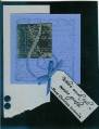
I loved this card so much that I tried to copy the bg before I even had the set. Boy, was THAT frustrating! Then my demo suggested that maybe it was cuz I was using photo paper instead of glossy paper. Oh. So after I used glossy, it was a LOT easier to blend the colours, although mine is still not NEARLY as nice!! I also seem to have gone off on a tangent with everything else... oh well. Couldn't put the sun in b/c it didn't work with the perspective...
Date: Thursday, March 9, 2006 GMT Views: 490
Favorited:7
Additional Info
Stamps: Summer by the Sea, Can't remember word set name...
Paper: Basic Black, Bashful Blue, Glossy White, Not Quite Navy
Ink: Black, Close to Cocoa, Handsome Hunter, Creamy Caramel, Almost Apricot, Not Quite Navy, Real Red, Only Orange, Summer Sun
I think your blending looks fine! Brayered backgrounds often don't look right when their first done. Trimming away the parts you don't like makes a big difference, as does stamping on it and then mounting it. Don't give up! I think this looks just fine, really! The more you play with it the less frustrating it'll be.