I threw everything but the kitchen sink into this project and I have to say that I'm well pleased with it. Here is the truth and nothing but the truth:
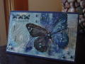
For MIX 17 (rough and smooth), my smooth is my Gelli Plate background, the gems and Crystal Effects (very old, could barely use it). The rough is the silver screening and the glitter. For MIX16 (glitter under glass), I did put Crystal Effects over some of the glitter on the butterfly. For MIX14 (do something different and 'modern' for you), I did a mostly blue card and used butterflies. Blue is probably my least favorite color (sorry) and I don't often use butterflies. I like them, just am not drawn to them as an image. For the F4A today, I repeated the butterflies, the gems, the Perfect Pearls and the staples. Whew.
Did you know that blue is chosen most often as a favorite color and yellow is the least favorite, according to CBS Sunday Morning last week? I'm just the opposite, although yellow isn't my most favorite, I just prefer it to blue. Green is my favorite, most any hue.
Date: Friday, May 24, 2013 GMT Views: 1672
Favorited:5
Registered: March 11, 2008 Location: Sacramento, California Posts: 39766
Fri, May 24, 2013 @ 3:34 PM
This is stunning, kitchen sink and all! hehe Love that gelli print. Your butterfly is gorgeous. Love the mesh stapled on. Fabulous card for sure. Love it! TFS :0)
------------------------------ Cathy B aka: Mutnik ....or is it Nutmeg?! I get so confused!
Smile.......people will wonder what you are up to! :0) Proud Fan Club Member 2010 DT forRubbernecker Stamps My Gallery
Registered: May 31, 2008 Location: Seattle Posts: 14509
Fri, May 24, 2013 @ 8:10 PM
Wowsers, I love blue and I love butterflies, so this is a complete winner in my book! Love your textural beauty!
------------------------------ SCS Fan Club Member
Thrilled to have been Featured Stamper #132
Thrilled to be a Puchkateer! Musezi
Thrilled to have been Queen for the Day #166
Thanks SCSers for all your encouragement!
Splitcoast Dirty Dozen Creative Crew SU Design Team Alumni
Registered: May 18, 2004 Location: Southwest Michigan Posts: 37151
Fri, May 24, 2013 @ 8:43 PM
I saw that color segment on Sunday Morning, and I could have written exactly what you did about color preferences! Now, to your card: Oh my goodness! This is awesome - it deserves a frame!!!!!
------------------------------ Claudia Splitcoast Fan Club Member
Registered: March 13, 2012 Location: Southern Florida Posts: 5253
Sun, May 26, 2013 @ 10:36 AM
I love blue! And I love this, although I would have loved it in green or yellow as well. All your elements are wonderfully balanced.
------------------------------ I have come to the conclusion that buying craft supplies and actually using them are two separate hobbies. RachelRose Designs by Robin... GALLERY
Registered: June 14, 2009 Location: Keller, Texas Posts: 8597
Mon, May 27, 2013 @ 5:23 PM
Wow! That butterfly is gorgeous, and I like the piece of screen you used and the liquid pearls and the bling and the colors! I was going to use a piece of plastic net, but my card went a different direction as they so often do in the Mixability challenges. Ha!
------------------------------ Val (a/k/a Greywolf)
Registered: December 15, 2011 Location: Abilene TX Posts: 11275
Thu, May 30, 2013 @ 10:10 PM
Oh. Wow! This is amazing!
------------------------------ JodyLynn - "Love me - love my cats!" DTGD12, DTGD14, HYCCT12, HYCCT13, HYCCT14, HYCCT15, Love Fest 2013, Love Fest 2014 CAS and CC guest designer QFTD 258