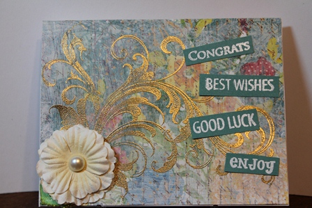
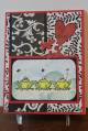
Wow...this is for the new Mix ability challenge and it's going to be a fun challenge...the little girl who always got in trouble for coloring outside the lines....and occasionally on the wood floors...is so loving this....
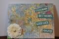
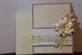
I used a light coat of gesso to tone down the wild dp and then decided the flourish would look good and embossed it in gold. I had something quite different planned but at that point I thought it looked almost done so added a flower and some wordage and called it good....
TFL....
ETA: I'm not any genious...the gesso to the dp wasn't planned to tone it down, was just practicing on piece in scrap box and liked what happened. this is the first time I've opened the gesso jar...
Date: Friday, February 1, 2013 GMT Views: 1149
Favorited:3
Registered: November 21, 2007 Location: Regina, SK Posts: 22971
Fri, Feb 01, 2013 @ 1:37 PM
Sheri, love that gold embossed flourish! It stands out beautifully against your gessoed background! And when I think about all the "too bright" designer papers I have...thanks for the idea to tone it down!
You know, I never thought about using gesso or paint to tone down a too bright paper. Wish I could find my gesso! I love your background, and that flourish is oh so pretty. Thanks for sharing.