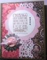
Bev asked us to use some sort of clear element on our cards for this challenge...instead I went with a clear card.
The photo just doesn't do it...after many tries...this is the best. That's the problem with clear cards...they look great...photograph really poorly LOL!
Here's what I used:
Paper: SU! Blushing Bride, SU! Basic Black
Ink: SU! Regal Rose, Memento Tuxedo Black
Stamps: Verve Beautiful You
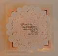
All the other stuff: Ellen Hutson doily, ATG, off cut from nesties squares, transparency
Splitcoast Dirty Dozen Alumni SCS Gallery Moderator Splitcoast Challenge Hostess Teapot Tuesday TEAm
Registered: July 27, 2007 Location: Dublin, Ireland Posts: 131572
Sat, Oct 27, 2012 @ 12:37 PM
LOL, this is precisely why I didn't make a clear card as a sample. I HATE trying to photograph them well, and I've made and mailed several more than the one or two I've actually posted here. I know how pretty this must look IRL, and I'm sure it will really impress whoever receives it.
Splitcoast Dirty Dozen Alumni Creative Crew SU Design Team Alumni Demo Challenge Leader Splitcoast Challenge Host
Registered: February 8, 2004 Location: South of Oklahoma, North of DFW Airport = North Texas! Posts: 44400
Sun, Oct 28, 2012 @ 10:12 AM
Ohhhhhhhhhhh, this is so beautiful! You're absolutely right about getting a good photo of clear cards to truly tell the story. Love the doily front too! Thanks a bunch for playing in my HYCCT Clearly Hopeful challenge!