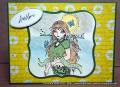
I was playing around with my new text stamp from Waltzing Mouse. The background looks so much better in real life. The green text is more visible and seems to tone down the yellow so that it matches the sun. The mermaid image was coloured with a mixture of copics and prismacolour pencils. I don't have a large collection of either especially a year ago so I was playing. I do love how it created a more realistic blend on her hair and softened the background. The colouring is not the best since I've improved a lot in that time. It's neat to see how I've gotten better with more practice.
Date: Sunday, October 21, 2012 GMT Views: 436
Favorited:2
Registered: August 17, 2008 Location: Queensland, Australia Posts: 6826
Mon, Oct 22, 2012 @ 4:51 AM
It's very good to play with our supplies so we can get better at using them. One thing I love about the HYCCT challenges is I get to utilise a lot of sample stuff I've stamped and coloured over the past 12 months and it gets to be enjoyed by someone else in need of a lift. Arrghh...the dreaded yellow - it's a funny colour to photograph. Well done on your colouring of your image.
Thanks for participating in my HYCCT challenge, I really appreciate the effort, and so will many others who will be touched by your gift of cardmaking for this cause.
------------------------------ Theresa Visit my blog In All My Glory
Splitcoast Dirty Dozen Alumni SCS Gallery Moderator Splitcoast Challenge Hostess Teapot Tuesday TEAm
Registered: July 27, 2007 Location: Dublin, Ireland Posts: 132012
Mon, Oct 22, 2012 @ 1:58 PM
Your text background is lovely and perfect for the challenge. We even have a special technique gallery for Copics with pencils, so I think many people have found that it's a great combination!