This is my submission for HYCCT1216, to have TWO times the fun...
First - my "twos":
Two stamps
Two designer papers
Two panels
Two colors of pearls
Two children
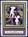
I had a terrible time getting a good impression with this stamp - three different papers and three different inks. I finally settled for this one since it seemed to be the best attempt. But it just looked kinda "cold" to me, so I colored it with watercolor pencils and went back over it with a damp brush (someday I'm going to get brave enough to actually paint!). Then I decided it needed a little something else, so I sprayed some PSST spray on my nonstick mat and made a paint by scribbling in it with my pencils. Oh, and I PAINTED over the watercolor image -yay! It's VERY subtle, but it's there. Doesn't look it in the picture, but the grapes are almost a perfect match to the purple paper.
Is it odd to color a silhouette stamp? I don't know, but I really like it!
Date: Wednesday, October 17, 2012 GMT Views: 564
Favorited:3
Splitcoast Dirty Dozen Alumni SCS Gallery Moderator Splitcoast Challenge Hostess Teapot Tuesday TEAm
Registered: July 27, 2007 Location: Dublin, Ireland Posts: 132008
Fri, Oct 19, 2012 @ 1:23 PM
I think that's just brilliant the way you coloured it. I'm going to have to check that stamp out! I'm assuming it's one of those where you stamp all that's black? I think I've quite often seen people colour those in, and I can't imagine that I wouldn't - but I guess I sort of think of them as reverse silhouettes, LOL. I love the contrast between the white frame and children and the coloured vine.