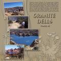
This page was for Nichole’s (yakshma) monochromatic digi challenge: “Find a photo(s) that you love and draw out a color using that as your basis for your layout. Everything is to be that color, text (play with text style/height to make it work), embellishments, stamps, etc. and add a shadow to make it stand out. Play with the opacity of the shadows to get depth.”
This was an interesting challenge and I really enjoyed it. I tried to keep to one color and just added effects to give it the depth and dimension Nichole was looking for.
I used the color picker in PSE9 to select the main beige background color. The grass and plant elements were in color; I removed the color then used the paint bucket to color them beige, changing the opacity or lightness as desired. I also added various degrees of drop shadows. On the photos, I added drop shadows to both the mats and the photos themselves.
For the title, I found a font I liked, but the “s” was odd looking, so I found an “s” from another font, resized it a little and lined it up using the align tool. I added both shadows and beveling to the title using the effects panel in PSE9. Although the journaling is hard to read here, in the full-size 12x12 it looks fine. I used shadowing and the bevel effect to raise the text.
Journaling:
"Whenever we go to Prescott, AZ, we always stop at Watson Lake, one of two reservoirs at the Granite Dells, outside of Prescott, Arizona that was formed in the early 1900s when the Chino Valley Irrigation District built a dam on Granite Creek. The rock formations are amazing. It feels like youÂ’re on another planet. The water is a beautiful deep blue. Local rockclimbers use the granite cliffs above and adjacent to the lake for top-roping and lead climbing, although weÂ’ve never seen anyone there other than a few canoes or people along the shore."
Credits:
Grass-Maggie May by Sweet Cravings Scraps; Plant-July 2012 Blogtrain Blog by Snickerdoodle Designs; Template 31-Mandagirl; Title Font-Bremen Bd BT (“S” is from Brando Engraved); Journaling font-Arial.
Date: Wednesday, August 1, 2012 GMT Views: 1176
Favorited:2
Registered: March 8, 2008 Location: michigan Posts: 9297
Thu, Aug 02, 2012 @ 7:55 AM
Wendy, Wendy, Wendy you have created a BEAUTIFUL page I love everything about it. It has inspired me to make another page I now get what Nichole's challenge was all about.
------------------------------ Candy Proud fan club member Nov. goal 17/3 YTD 72 please visit my GALLERY
Registered: February 9, 2010 Location: Southern California Posts: 4153
Thu, Aug 02, 2012 @ 9:37 AM
Awesome! I would have been tempted to pick blue as the monochromatic color, since it's "prettier," but you made the absolute right choice. The beige really makes your pictures stand out, and I love the description of how you created the page. Great job.
Registered: May 11, 2007 Location: two hours from all the fun Posts: 4529
Mon, Aug 06, 2012 @ 4:04 AM
really cool! great job!
------------------------------ *tamcan *i think i can. i think i can. Goals for 2014
Dec. 5 cards a week:_260__
2 Layouts a week:_104__ My Papercrafting Blog My Gallery