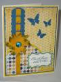
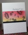
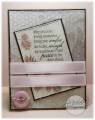
I used a favorite layout w dry embossing on the bottom and masking off a center section. The center section is simply sponged with Daffodil and Primrose. I thought this would be a more uplifting type of sympathy card and you could send it well after for a quick note.
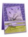
What do you think of this unusual combination of colors and textures. Thanks for viewing and commenting as I return to the gallery after an absence.
Date: Sunday, July 15, 2012 GMT Views: 1030
Favorited:19
Registered: May 23, 2003 Location: Ontario, Oregon Posts: 9432
Sun, Jul 22, 2012 @ 6:49 PM
Another beautiful creation by you. I started to browse your gallery and I am so taken with your designs, you have a rare talent!
Love the colors of this card - the contrast between the bright hots and the starkness of the black & white is so striking and the texture adds another layer of interest. Very nicely done.
I just found out I need to have a sympathy card and your example has inspired me to step away from the safe, subdued colors that I tend to use for this type of card. TFS.