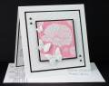
I used the complimentary color combo of blue and orange for the challenge, my colors are much lighter than the wheelÂ’s brilliant examples.
The flower is what comes on the designer paper and itÂ’s a shame to half hide it behind a panel so I let it be the focal point of the card.
I used the Perfect Layers tools from Perfect Paper Crafting to cut the even borders and they aksi work great for getting an equal spacing distance between panels. I also used the Perfect Square for cutting out the flower. Use can any brand craft knife or rotary cutter for cutting. A tutorial video can be found on the company site in the link I provided.
The butterflies are from Cheery Lynn and I cut the bottom layer from regular cardstock and the top from vellum. The pearls are self sticking. Glitter Adhesive was used to attach the vellum to cardstock and then to the card, it was also used to attach the black gems to designer paper.
Stampin Up mat pack and Bazzill piercer were used for the faux stitching holes and a Copic multiliner pen was used for the faux thread.
ItÂ’s rather hard to see here but I also used the butterfly die to emboss the envelope by taping two cut butterflies to the clear sheet used with the Stampamajig but just paper will also work and could be stored for later use, place it in the envelope with the butterflies to the front and run it through the machine. A photo tutorial can be found in this direct post link on my blog.
Registered: June 14, 2011 Location: Westminster Colorado Posts: 43
Thu, May 17, 2012 @ 10:05 AM
Gorgeous card. Love the answer to the color challenge.
------------------------------ Crafty Colonel
"The price of freedom is eternal vigilance." Thomas Jefferson
Follow my blog at http://craftycolonel.blogspot.com/
Registered: July 12, 2005 Location: Hugging a golden and stamping' in PA Posts: 21216
Thu, May 17, 2012 @ 1:58 PM
Gorgeous use of these complementary colors, Roxie! Love how you left the flower be the main attraction and the faux stitches are the perfect accent! I always love how black makes any color combination pop as it does here!
Registered: January 6, 2004 Location: Connecticut Posts: 20543
Thu, May 17, 2012 @ 7:03 PM
Roxi, I love the soft blue and peach colors you used here and thanks for all the great tips. I love the one about embossing the envelope! What fun!
------------------------------ Rediscovering the simple joy of stamping and exploring my art! Stamp your ART out! Share your thoughts. Let your heart sing.
Come check out my Gallery and leave a comment!
FS465
Registered: August 30, 2006 Location: Saugus, Massachusetts Posts: 65057
Fri, May 18, 2012 @ 5:58 AM
Love the lighter hues of orange and blue on this Roxie - that flower is beautiful - cute little 'stitches' connecting the panels the papers and butterflies are wonderful!
------------------------------ Julia Aston Proud member of SCS Fan Club and Dirty Dozen Alumni, former DT member on Color Challenge My Blog