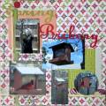
We were to stretch the title across the page and I used the 2nd sample sketch provided as a "leaping" off point to get started.
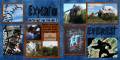
The blue and brown papers used are by Ann Ominous from the Boys 2 Men kit at Divine Digital. Most of the pictures I used were images I downloaded from the internet because I didn't really get too many nice ones on my own and the font was one I just downloaded since I thought it needed a 'scary' one...Monsters Attack! I outlined the words in black and offset the 2 a bit to give a shadowed effect.
TFL!
Date: Sunday, April 1, 2012 GMT Views: 702
Favorited:2
Registered: March 28, 2008 Location: Canada, eh! Posts: 537
Sun, Apr 01, 2012 @ 9:25 PM
Great idea to use the photos from the net....how else could anyone possibly get such good pictures when the coaster is going like gangbusters!! Good on you for grabbing them. I love your colours and your choice of font for the layout.
------------------------------ laughingLARGE
Laugh lots, and when you're old all your wrinkles will be in the right places.
Registered: April 5, 2008 Location: Florida's Space Coast Posts: 24517
Sun, Apr 01, 2012 @ 9:56 PM
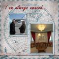
very dramatic pages. What I love best, besides the impressing title work, is the cube where the journaling is, love how the collections of pics are right in there instead of just a journaling block. Love it!
------------------------------ Joyce Ann - Layouts completed: 2022/ 218; 2023/ 71. Layouts for 2024: Jan 3=72, Feb 3=75


 I outlined the words in black and offset the 2 a bit to give a shadowed effect.