Registered: April 20, 2005 Location: Lancaster, PA Posts: 6319
Fri, Mar 16, 2012 @ 1:46 PM
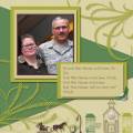
Nice CASE..I really like that layout look. I especially like the 2 strips you used as well as all the different papers. I like how you made the X larger than the rest of the letters in your title to emphasize it.