Registered: March 15, 2005 Location: Iowa Posts: 7287
Tue, Feb 28, 2012 @ 2:04 PM
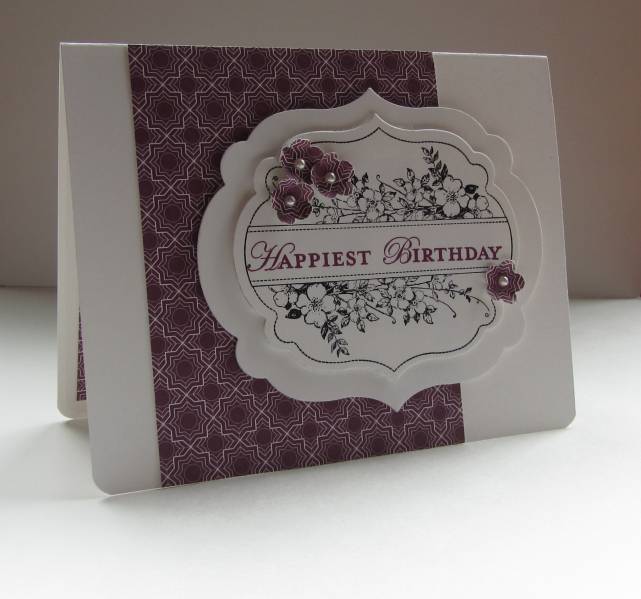
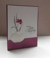
A lovely card and how neat is that to use the pattern in the DP to punch out your flowers. The white layers with the stamping look like fondant on a cake. You are making me want this set and die cut. Agghhhh!!! You are not helping me with my habit. LOL glad you had a good time on your trip. TFS
------------------------------ Sherlie..... aka Surelyyoustalktoo? Just living is not enough, one must have sunshine, freedom, and a little flower,and a few stamps, of course, www.splitcoaststampers.com/go/Sherlie
Registered: December 30, 2004 Location: Where ever I go...there I am! Posts: 64166
Tue, Feb 28, 2012 @ 5:08 PM
Very nice Nancy, those pearl centers really add a lot to the flowers and I like that they are punched from the designer paper, great die cuts shapes too.
Fabulous CAS design, Nancy! I LOVE that main label and the fact that you didn't color the flowers--but used the punched ones for pop! The razzleberry sentiment really stands out! What a truly elegant card, my friend!
Registered: February 21, 2009 Location: Mt. Pulaski, IL Posts: 29131
Tue, Feb 28, 2012 @ 8:20 PM
Gorgeous and elegant! I love the colors. I had pretty much decided I didn't want this set/dies - but seeing your card - now I need to rethink that one!
------------------------------ Kathy - 101 Airborne - My Gallery and My Blog