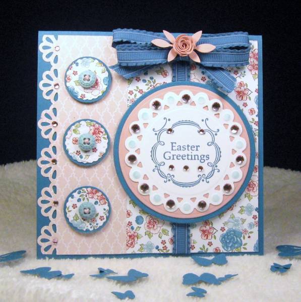
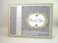
I really love the SU Twitterpated DSP and matching buttons. I decided to use this fun pattern and colors for an Easter card. I probably should have steered clear of the Island Indigo as it is a deeper blue, which isn't really springy, but it made such a nice pop off the pink that I went with it.
The stamp is from the $1 bin at Michael's which I stamped onto my beaded circle nestie. I sponged the beaded areas and added bling on every other circular sponged area. Popped up the whole panel on dimensionals.
I used the smallest circle bead diecut for three circles on the side to which I matted with a circle punch and topped with matching buttons tied with pink floss.
I used a border punch down the left side and added some more bling. Last, but not least, I added my double loop bow and placed a small rose and leaves in the center. My MS pine branch punch broke while I was doing this. My favorite punch!! It's retired now, but I found one on e-bay - hope it works good. Can't live without that punch.
I think that about does it. Thanks for taking a look and have a great week!
PT: 13
Date: Monday, February 27, 2012 GMT Views: 1541
Favorited:6
Paper: SU Twitterpated DSP, Island Indigo and Blushing Bride
Ink: Island Indigo, Baja Breeze for sponging
Accessories: MFT Rolled Rose Diecut, MS Leaf Punch, MS Flower Border Punch, Circle Punch, Beaded Nestie Diecuts, Circle Nesties, Island Indigo Ribbon, Dimensionals, Bling, SU Twitterpated Buttons, Pink Floss
Registered: July 9, 2008 Location: Stars Fell on Alabama Posts: 74686
Mon, Feb 27, 2012 @ 6:38 PM
Well, if this isn't a pretty one...love it! Great paper and I love that ribbon/bow treatment. Is this your signature bow? Should be. Oh, drat...those punches. I have broken one or two in my days of crafting, too. It's maddening.
------------------------------ My Blog---My Gallery---My PinterestI'm a Punchkateer! (Prez) FOREVERDirty Dozen Alumni2014 CAS Spring DT--- Inspiration Challenge Co- Hostess 12/02/17-12/28/19 Watercolor Wednesday Design Team Hebrews 13:2Brenda
Registered: January 21, 2007 Location: Winnipeg, Manitoba Posts: 5463
Mon, Feb 27, 2012 @ 7:07 PM
I love this card. Love the blues and pinks and this gorgeous DP with matching buttons. You have put these all together so well on the beauty. I love how you did the ribbon and bow. So glad you were able to find a punch to replace your broken one.
Registered: December 15, 2008 Location: Kingsland, Georgia Posts: 29927
Tue, Feb 28, 2012 @ 5:34 AM
This card has "Sweet" written all over it!!! How cute those buttons are going down the side. Love this pretty layout. You have created a most amazing Easter card. That punch must be notorious for breaking because I broke mine as well just last year. Broke my heart until I replaced it myself. So glad you found another one. Hip Hip Hooray on the punch count too!!!!
xxx ooo
Bearzi
------------------------------ My Blog Punchkateer
Registered: November 9, 2004 Location: Hampton Roads, VA Posts: 9413
Tue, Feb 28, 2012 @ 5:15 PM
Ooooooooooooh - how special is this! Love love love it! That paper is soooo Fabulous - and I do love the blue background. Love the fun ribbon-bow and rolled rose flower, love the buttons, bling and punched detailing - it's really quite beautiful Twinzi!!
Registered: June 4, 2009 Location: Deatsville, Alabama Posts: 82242
Wed, Feb 29, 2012 @ 2:55 AM
Wow Sis, this is scrumpious. Has a country/fresh/vintage/punchy look to it. Love all the details, and I now want that dp when before I didn't look twice at it. You could be the spokeperson for that $1 stamp too - if I wasn't on crafty supply restriction, I would want to go get it now. LOL! This is really, really pretty and I love it. Hugz!!!
------------------------------ Nancy Williams - Hope your day is Spirit-filled and ink-filled (in that order)!DRS Designs-DT, Punchkateerforever, Dirty Dozen Alumni
Registered: February 26, 2009 Location: Minnesota -- The land of never-ending winter (or so it seems)!! Posts: 734
Wed, Feb 29, 2012 @ 7:12 AM
I agree, I really like that dp, as well. Even though the blue is not pastel, it really does add a nice contrast to the dp and makes the whole card stand out. Beautifully done!
Registered: June 30, 2006 Location: Milwaukie, OR Posts: 16258
Wed, Feb 29, 2012 @ 1:14 PM
I had to pop into my good friend, Pam-e-kin's, gallery to get my sweet and pretty fix. Girl...you did not disappoint! This is so wonderful. Thanks for the Twitterpated fix.
------------------------------ Happy Stamping - Regina
Want to see the rest of My Gallery?
Check out the Creative Crew for some great Stampin' Up inspiration!
Registered: July 18, 2006 Location: Beautiful, British Columbia, Canada Posts: 24229
Thu, Mar 01, 2012 @ 9:19 AM
Gorgeous card, Pamzi!! Love the colour combo and the DPs you used. I have avoided that nestie, but you have made it look very tantalizing based on how you have used it! Great layout and lots and lots of punches
------------------------------ "For I am confident in this, that He who began a good work in you will complete it until the day of Christ Jesus" Phil 1:6 Verve Diva My Blog My SCS Gallery