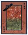
Ha! That's if you have a good imagination. This is my Wrinkle Free Distress card. Card looks better than the pic. But...I couldn't seem to get enough paint on the picture. The white is showing. Was that supposed to happen?
I used water color CS and Ranger Distressed ink - put the CS on LOTS of times. The CS was getting very "flexible" because it curled so many different ways.
When I gave up on a solid color bg I stamped the Cornish Heritage Farms daisy with Ranger Distressed Black Soot and topped it with clear embossing Pwdr. tfl
Date: Wednesday, February 15, 2012 GMT Views: 793
Favorited:2
Registered: February 5, 2007 Location: St. Louis, MO Posts: 92541
Wed, Feb 15, 2012 @ 9:43 AM
Carol, I think you achieved wonderfully rich tones with the technique. I personally like the white showing....shows that it is cold-press watercolor paper with that texture. Lovely flower image that you chose for your outline stamp and the co-ordinating ones on the bg panel. It is an artisstic card IMO.
Registered: March 7, 2009 Location: Where the corn is knee high by the 4th of July Posts: 17498
Wed, Feb 15, 2012 @ 11:41 PM
I love the rich colors of fall that you've achieved on this card! I don't know about the white showing ... I've only ever used matte or gloss when I've done this technique. I think it looks good w/the white showing because it sets off the darker colors and adds a great texture. I like the CHF flower and the bkgrd flowers look nice.


 This is my Wrinkle Free Distress card. Card looks better than the pic. But...I couldn't seem to get enough paint on the picture. The white is showing. Was that supposed to happen?