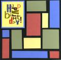
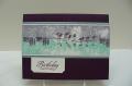
Here's the second attempt - better than the first as far as different shapes and sizes - but I see that I mis-cut a couple of pieces and have too large of black space showing in one area. Third times a charm - but I don't know if I like the technique well enough to try a third one.
Date: Tuesday, January 31, 2006 GMT Views: 920
Favorited:19
Registered: January 17, 2005 Location: Ontario, Canada Posts: 534
Tue, Jan 31, 2006 @ 4:16 AM
I like your card. Alphabet Soup is not a precise stamp, your extra black spaces look good with this stamp. I also like the way you've used the blocking colors in the letters of the greeting.
Registered: January 14, 2004 Location: enjoying retired life in FL! Posts: 24335
Tue, Jan 31, 2006 @ 5:19 AM
oh my goodness, this is a GREAT card and certainly one that I would never have the patience to do so far as lining it up, marker-ing the colors onto the stamp, etc. Very cute!
Registered: March 31, 2005 Location: H-town Baby! Posts: 4182
Tue, Jan 31, 2006 @ 5:43 AM
This looks great! It reminds me of the Partridge Family! Not sure that is what you wanted to hear but thought I'd share my random thoughts! This card really popped out of the gallery at me. I love it!! TFS!
Registered: May 15, 2005 Location: Charlotte, NC Posts: 8029
Tue, Jan 31, 2006 @ 7:08 AM
Terrific colors and design. Especially like the matching colors on the Happy Birthday. I didn't even notice the larger black space. It's a wonderful card! Going into my favorites for future inspiration a.k.a. CASEING! TFS