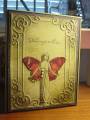
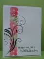
I have to admit something: the color challenge is always the hardest for me and I rarely do it. I know, it's a terrible thing to admit. It's hard for me to think color first and I don't have most of the SU colors so I have to think really hard about what I have that is close. Thinking is good but.... However, lucky limeade is a favorite color of mine, I had the cardstock so I really did think hard and ....EUREKA. As soon as I thought of this butterfly fairy stamp, the rest fell into place and I'm so pleased with myself. The dp I used for the paper pieced wings actually has big butterfly wings on it, which I thought was appropriate. The ef is called Tiffany, which I also thought appropriate for the art deco fairy. I sponged some black on the ef parts to make it pop a bit. Only one folder by the way, I tried but thought it was too much to have two. This card is slightly oversized by the way.
Thanks for listening to my ramblings and for looking. I promise I will try the color challenge more often.
Date: Tuesday, January 24, 2012 GMT Views: 1226
Favorited:14
This is stunning. Very elegant. That touch of black you added sets your image off perfectly. It makes your fairy look as if she is "back-lit." You actually see that better in the small thumbnail size print.
Registered: August 15, 2007 Location: Twin Cities MN Posts: 50658
Tue, Jan 24, 2012 @ 12:43 PM
Your fairy has an ethereal quality to her..so pretty! The embossed frame together with the image give this a fabulous vintage look to it..marvelous! Please do the color challenge more often....this is a real winner!