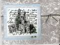
Just playing around with borrowed stamps. Opinions about the ribbon, please. Does it go with the rest of this card or would light blue grosgrain look better?
Date: Monday, January 23, 2006 GMT Views: 785
Favorited:18
Registered: September 7, 2004 Location: Posts: 239
Mon, Jan 23, 2006 @ 4:31 PM
I like the black too, because of the dark dots. If the blue had the same dark dots, then maybe, but I don't think plain light blue would be enough. Love the gray--so elegant!
Registered: August 30, 2004 Location: in a whirlwind of activity that never stops! Posts: 2482
Mon, Jan 23, 2006 @ 6:04 PM
I like the black better. Since you asked... I don't actually care for the blue with the really pretty black, gray, and white that you have on the rest of it. Soon as my floral stamp gets delivered, I think I'll try this like you did it (love the layout and the great way to use gray) but with a black matte and coloring the castle with gray instead of blue. Just me, though. Obviously others like it with the blue, too!
------------------------------ --Sandi desperately trying to eliminate some of the clutter in my house!
Registered: April 7, 2004 Location: Part of the Phelps and Gorham Purchase Posts: 822
Mon, Jan 23, 2006 @ 6:13 PM
Okay, this card is totally mint, and I think either ribbon would work, but I would add silver cording to the mix. The focal image is so big, bold, and sassy that the ribbon needs a bit more "weight." Hope you're feeling better!
------------------------------ Danielle
"Love is never wasted. It may not be reciprocated,
it may not be fully appreciated,
but it is never wasted."
Neal A. Maxwell