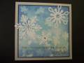
Mary Marsh gave us the following vibrant colors for todayÂ’s Color Challenge:
Pacific Point
Daffodil Delight
Rich Razzleberry
The dessert was to add a brad or button with a summery theme. Since I didnÂ’t have an appropriate one, I didnÂ’t add one.
I decided to use todayÂ’s colors in inks with a brayer. Obviously, you can see the blue and yellow. I forgot color theory when I added the Plum Pudding ink over the yellow. Complementary colors cancel one another out and I ended up with a more burnt sienna tone than true plum. I always brayer light to dark when I use this techniqueÂ…..maybe this time I should have done a corner in the Plum Pudding before the yellowÂ…..but I doubt that would have worked either. IÂ’ve been gone this week-end so I ran out of time to do another. : (
It’s been fun being a guest designer this past month and I thank Betty Wright for the opportunity….and all the “color ladies” who gave us wonderful color combinations to work with. : )
TFL
Date: Monday, May 30, 2011 GMT Views: 6298
Favorited:101
Registered: October 21, 2007 Location: Alberta, Canada Posts: 6707
Mon, May 30, 2011 @ 8:11 PM
A very beautiful card!
------------------------------ Lynn
SCS Fan Club Member "Everyday is a gift, that's why they call it the present." author unknown http://jellybeandancer.blogspot.com/
Splitcoast Dirty Dozen Alumni Creative Crew SU Design Team Alumni
Registered: October 29, 2004 Location: Coos Bay, Oregon Posts: 24007
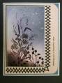
Mon, May 30, 2011 @ 8:56 PM
Sallie, you are making me want to get out my brayer and silhouette stamps. This is a beautiful, beautiful card. I love you simple neutral colored frame too. TFS