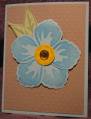
Wish I could find a better place to take pictures. The challenge was to use aqua, lt green, kraft and a bit of yellow. I left the bottom space empty so I could stick a sentiment on the bottom at the last minute (I am bad about doing cards in a timely manner!)
Date: Sunday, May 22, 2011 GMT Views: 190
Favorited:3
Registered: April 3, 2008 Location: Golden Gopher country Posts: 3469
Mon, May 23, 2011 @ 5:12 AM
I hear your frustration with photo location! I often end up setting my cards on the range--not ideal!
Your card looks great in the thumbnail, but really comes to life when enlarged. Wow! The Swiss Dots set off the big blue flower so nicely, and the colors are so soft and sweet. I love the simple layout, too.
------------------------------ Sarah/Mrs (R) "You want to be more careful. Hanging around like this, people will think you're up to something." Severus Snape Superglew! Blogs