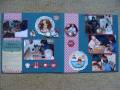
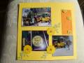
My entry for challenge D from Virtual scrapbook Night: build a layout starting with Kraft paper and add the colors red, green, and orange. I thought that would be perfect for pictures from Chuck E. Cheese. I always struggle with scrapping all those bright colors, so the Kraft was a perfect way to tone them down, plus I just used scraps of cardstock (no patterned paper) to minimize the busyness. I decided not to add any bling (the optional garnish) right now, but I may go back and do it later, maybe some glitter on the stars.
Date: Monday, May 9, 2011 GMT Views: 565
Favorited:3
Registered: November 16, 2005 Location: Glendale, AZ Posts: 26620
Mon, May 09, 2011 @ 7:16 PM
Wow, your layout of all those pics really works. I like how you did the title--the white against the kraft looks good. The stars add just the right amount of pizzazz too!
------------------------------ Wendy B in Sunny AZ
Registered: December 4, 2004 Location: Hanging out in Scrap World Posts: 17685
Thu, May 12, 2011 @ 9:11 PM
Cheryl you have a great knack for putting multiple picts together well! This is such a GREAT layout for Chuck E's. I miss the days of Bday parties there. These picts look great on the Kraft background
------------------------------ Lela -- Scrap Blog -- Come Scrap With Us ---- YTD 87 / 300 Pages 2023 -- 64 / 252 Cards 2023