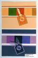
Working on SWAPS for Leadership and Memphis Regional. Need opinions on these cards.
The blocks are cardstock inked with versamark and clear embossed. So they look like tiles. I like the purple monochomatic card, but my DH likes the neutral monochomatic one.
Suggestions? Opinions?
Date: Thursday, December 29, 2005 GMT Views: 677
Favorited:13
Registered: October 6, 2004 Location: Nothern VA Posts: 635
Fri, Dec 30, 2005 @ 2:14 PM
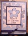
Just a suggestion:I think it would look good to stamp across the colored squares using white craft ink and the "smile" stamp from the wonderful words II set. They are both a great layout idea. Good job!
Registered: February 5, 2007 Location: Arizona Posts: 158
Sat, Mar 31, 2007 @ 9:05 PM
I'm always partial to the jewel colors, but in this case, the other card looked like the colors went together better. Maybe with just a different choice of colors with the purple, it would pop better. Wish I could come up with suggestions but I can't right now.