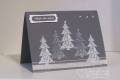
I must think I am Picasso (LOL!) as I seem to be going through my blue period. Oh, well, maybe I will change color tomorrow.
I used a digital image by DeeDee for her pastel spring challenge. http://happymondaychallenge.blogspot.com/
The DP is by Recollections. I used my only bird punch - a dollar one from Mike's. Colored with pastel chalk pencils, hoping to give the bird house a rustic look.
Date: Thursday, March 10, 2011 GMT Views: 404
Favorited:2
Registered: January 20, 2010 Location: Brampton, Ontario Posts: 26243
Thu, Mar 10, 2011 @ 7:00 PM
I really like the tilted panel behind your main image! A good reminder for me to try and look beyond the straight and centred for my cards. The colours are great too. TFS!
Registered: August 26, 2005 Location: Michigan Posts: 1151
Sat, Mar 12, 2011 @ 12:29 PM
Oh, my what a beautiful soft blue! Blue is good, keep going if you feel the urge. I love the way you colored the bird houses and what cute little punched birds. We love to see you at the Happy Monday Challenge, thanks for your support!
Registered: October 4, 2005 Location: California, USA Posts: 3706
Mon, Mar 14, 2011 @ 8:58 AM
Well your blue period is truly LOVELY, Dorothy! I really like how you laid this out, and the sweet little birds you added. Thanks so much for sharing this!