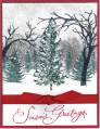
I am not gifted with much creativity and I usually have to CASE if I want anything to look good. I am attempting to make a simple Christmas card for NEW stampers but still teach techniques. This one is showing the repeat stamping for different hues of the same color, but I am needing opinions on this! I am not liking it much, but there are some things I like about it. Very hard to see but IRL, there is liquid applique on the darkest trees. Can any of you experts tell me what it's MISSING? I can't put my finger on it....maybe it's the trees at the bottom...maybe it's the trees itself on the strip that I'm questioning??? HELP!
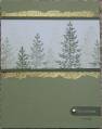
EDITED PHOTO: I had so many ideas given to me and I'm one to try them all at once...
I like it better now and I tried adding gold cording to the side, but I wasn't sure I liked it...maybe it was too much gold. I never know when to stop. I just don't have an eye for that. IS IT BETTER NOW?
Date: Saturday, November 26, 2005 GMT Views: 2027
Favorited:69
Registered: May 7, 2003 Location: Laycock house of cats Posts: 10662
Sat, Nov 26, 2005 @ 3:29 PM
I like this a lot. great card for beginners.
Do you have some gold ribbon? IMO, you could make a good card better by punching holes in the Word Window punched corners and tie little pieces of gold ribbon through them.
Registered: November 7, 2004 Location: California Posts: 1133
Sat, Nov 26, 2005 @ 3:35 PM
I really like this! Maybe gold cord along the left side, tied in a knot or bow and how about a gold brad on one or both of the word tabs? Or I think that if the christmas tab was in the AA color and you stamped "wish" directly on the card under the tab it might smooth out the movement your eyes follow on your design. Your colors and stamping are awesome! Good luck!
Registered: June 24, 2004 Location: At home Posts: 2020
Sat, Nov 26, 2005 @ 3:52 PM
It's pretty! Instead of the trees on the bottom could you maybe stamp part of a background stamp or another subtle pattern? The bare trees don't really jive with the pretty pine trees. Just my $.02.
------------------------------ Debra ---artist * teacher * designer Say yes. Be generous. Speak up. Love more. Trust yourself. Slow down. ---Patti Digh
Registered: August 27, 2004 Location: home of the stamping viking goddess Posts: 40462
Sat, Nov 26, 2005 @ 3:57 PM
I really like it a lot too. I like the idea of a brad on one of the word papers too. I wouldn't change it too much because it really is beautiful just the way it is, Great Job!
------------------------------ I'm a loser ~ 19.2 pounds gone...lots more to go!
Registered: May 6, 2005 Location: San Angelo Texas Posts: 131
Sat, Nov 26, 2005 @ 3:57 PM
Well I just love this card. It popped right out at me. The layout and the colors are great. The strip with the trees is flawless. I think it is perfect for those who are new at stamping. It is simple and elegant at the same time. I will be CASEing it tonight after the youngins go to bed. Thank You for sharing. I hope I can do as good a job as you did.
Tina
------------------------------ To stamp, or not to stamp.....WHAT A RIDICULOUS QUESTION.
Registered: July 30, 2005 Location: Kansas Posts: 1043
Sat, Nov 26, 2005 @ 3:57 PM
I appreciate anyone's $.02 worth! I am needing to learn about the "eye movement" thing and "balance" and "weight", but can't quite figure out what makes what do what and in what direction. Keep 'em coming ladies!