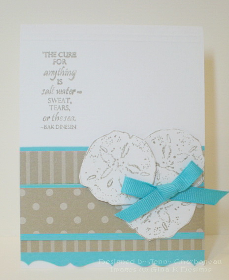
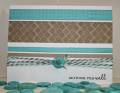
I don't usually use this many layers on a CAS card. Thankfully, it still looks clean and simple and is without many embellishments. I didn't intend to get carried away with the layers. It all started when I couldn't decide on which kraft dsp to use. I finally decided that they looked good together. I needed some turquoise since it was part of the challenge. Without even thinking about CAS, I decided that it just looked too dull without highlighting both patterns. It wasn't until it was put together that I realized what I had done! LOL! Thankfully, CAS is a subjective term and there is no right answer or exact definition to explain it.
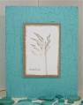
These colors make me think of enjoying the view of the sea while sitting on the beach. It's a gift from God... His creation... that can calm me with the sights and sounds.
RECIPE
Stamps: Gifts from the Sea (Gina K Designs)
White CS: Georgia Pacific
Turquoise Sea CS: Gina K Designs
Kraft dsp: Stampin' Up!
Ink: Crumb Cake: Stampin' Up!
Ribbon: EK Success
Other: Scor-Pal & pop-up dots
Date: Sunday, August 22, 2010 GMT Views: 2377
Favorited:14