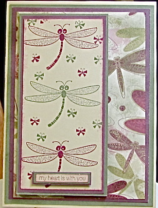
This week's CCEE challenge was issued by Jojot. She gave us a great sketch with the twist of using monochromatic colors.
I really like the colors of my card today and the simplicity of it, but now that I am looking at the picture of it, it looks way too plain.
Take a look at the other team members cards {url=http://cceestampers.blogspot.com/] HERE[/url]. We welcome anyone to join us in the challenge and you can get the details on the blog.
Date: Thursday, July 15, 2010 GMT Views: 1784
Favorited:6
Registered: October 27, 2008 Location: Florida Posts: 1452
Thu, Jul 15, 2010 @ 11:48 AM
The dragonflies caught my attention. I like it the way it is, but if you think it is too plain wrap some ribbon around the bottom or even just a little bow. Or maybe stamp a few dragonflies cut out and pop up with dimensionals.
Registered: April 20, 2005 Location: The only Eaton Rapids on the Earth, Michigan Posts: 57568
Thu, Jul 15, 2010 @ 1:08 PM
I have this stamp set still, too, and this is one of my favorite dragonfly images. I love how you've used it on your pretty card with the coordinating, dp, Shirt. I don't think it's plain at all. You've got enough going on with the images and dp that you really wouldn't want to overdo it with extra embellishments.
Registered: July 17, 2005 Location: Staying inky in eastern Connecticut Posts: 79205
Thu, Jul 15, 2010 @ 5:15 PM
I think this dragonfly beauty is perfect...the blending of the images with the gorgeous dp was clever.....and I think anything else would have hidden their beauty.....I know that we all feel a need sometimes to 'add a bit more', but often it is better to keep it clean and crisp...I love it
Registered: April 25, 2006 Location: Northampton England Posts: 1502
Wed, Jul 21, 2010 @ 6:33 AM
Wow I love your very pretty red and green dragonflies, "plain" no way sis you have got to be kidding ! It's a wonderful design, and just perfect as it is.
------------------------------ Christina
When the power of love overcomes the love of power, the world will finally know peace.