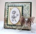
Betty's colors for today's Color Challenge were: Close to Cocoa, Barely Banana, Garden Green and neutrals of choice.
There was a dessert of flourish(s) of gems or pearls which I chose not to do and a "cherry on top" of a light sky blue, which I opted out of also.
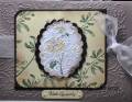
This is another one of those Hero Arts stamps that puts down the background. I used the acrylic paint for "ink" and then clear embossed it. This was an experiment...someplaces it took and others, it didn't. I liked the effect, so I kept it.
TFL
Date: Tuesday, June 1, 2010 GMT Views: 1617
Favorited:13
Registered: June 10, 2007 Location: BC Posts: 44872
Tue, Jun 01, 2010 @ 4:43 AM
Oh so gorgeous and understated!! Lovely card!!OH!! I've seen that hero arts image and had no idea what I would do with it!! Good thing we have artists like you!
Registered: January 6, 2008 Location: Richmond, VA Posts: 3279
Tue, Jun 01, 2010 @ 6:54 AM
Nice card, Sallie! It looks so dream-like! We must have the same taste in stamps, as this one is on my "wish list" and has been for a while! I know we have some others that are the same, too!!
------------------------------ Gail
"In the beginning, God created..." and He still does!
Registered: April 6, 2005 Location: Stuarts Draft, Virginia Posts: 14401
Tue, Jun 01, 2010 @ 7:54 AM
Great artsy card, Sallie! So different and unique - gorgeous!
------------------------------
Wanda Cullen ~ Dirty Dozen Alumni, On design team for Papertrey Ink, Designer for Color Throwdown and Fusion Card Challenges Cullen-ary Creations[/URL]...my blogHERE'S MY GALLERY[/URL]
Registered: August 21, 2007 Location: Wayland MA Posts: 105288
Tue, Jun 01, 2010 @ 10:16 AM
This is really pretty Sallie! I love the texture and feel of this image!
------------------------------ Anne HarmonFS154, QFTD58, PROUD FAN CLUB MEMBER (photo of our Great Granddaughter Elise, just 6 months old) and me, even older.