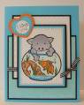
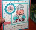
I stamped the image with black soot distress ink and coloured it with a combination of prismacolors and copic markers. Now, about that bowl... I accidently used Tim Holtz crackle accents instead of glossy accents. Note to self; READ LABELS!!! I love the idea of this look, but next time I will also stamp the image in an ink that isn't water soluble. :( The distress ink ran and gave the bowl a bit of a pewter look. This isn't what I intended, but I can live with it because it ended up looking kinda cool - like some depression era pressed glass.