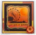
Despite the INTENSE color I chose for this Summer card, there is not a lot of elements to it. I stamped the scene in Versafine Onyx Black. The scene just screamed out to me to use these intense warm colors. Is is too much? I cut out the scene using my Spellbinder's Labels One. I masked a circle for the Sun and masked off the words along the bottom. Then I airbrushed, and airbrushed, and airbrushed until I was satisfied, layering my colors from the top down. I think this would be a fab image to brayer over too, but you know I am still hopelessly brayer challenged. To create the sun - I used the reverse portion of my mask to cover the scene (so I only saw the circle for the sun) and I airbrushed again, keeping the deeper color heavier on the left side. I added a little crystal lacquer over the left side of the sun. I added a curved line of the lacquer along the sun's left edge, then used a toothpick flat against the paper to drag it towards the center of the sun, stopping about half way. It just seemed to need something, and I liked the way it finished it. The Crystal Lacquer seemed to give it a little texture and depth. I removed the mask covering the words and used the same Copic Colors to airbrush layered colors along the bottom. I added the little black ribbon securing it in each corner with a brad. I had an ugly place in the lower right corner where the ribbon ends showed -- so I covered it up with a flower, blinged it up in the center and added a dollop of Lacquer to keep all my little gems neatly in their place. And of course I could not stop myself from added some dots with an Orange Souffle pen and some black stitching marks around the edges. I am addicted to doodles. Whew. I said there was not a lot of elements to this card, and there isn't. But I guess I was feeling wordy today. Anyone out there stick with it and read this entire post??? Besides my stepmother?
More close up pics on my blog.