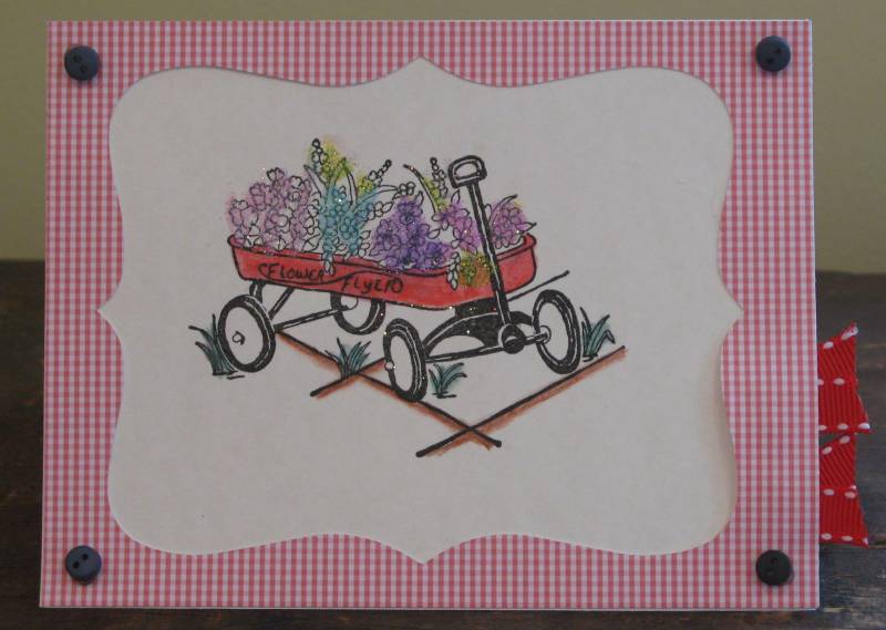
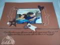
I got this stamp for my birthday yesterday, so I was eager to try it out!! I like how the colors go together and all, but I think that it needs something more around the wagon. Please let me know what you think - and if you have any ideas on what to do in the empty space, please share them as well!! TFL!!!!!!!
~Rebekah
Date: Thursday, August 27, 2009 GMT Views: 10770
Favorited:3
Additional Info
Stamps: Great Impressions Wagon
Paper: Assorted
Ink: VersaMark
Accessories: Buttons, Ribbon, Watercolor Pencils, Blender, Top Note Die, Glitter
Registered: August 9, 2004 Location: Fort Collins, Colorado Posts: 33063
Sat, Feb 13, 2010 @ 1:05 PM
Very cute stamp and I do like the layout here. Because you are asking for constructive 'advice' (I don't do criticism), you might try adding a sentiment down in the lower right corner on the main image panel. Also, you could bring that ribbon up and tie it around the frame. Those ideas would keep it CAS. Now, if you want to go a little more elaborate, you could add a punched butterfly popped on dimensionals. You do great work, Rebekah. Keep it up!
------------------------------ ~* Holly *~ Gallery Blog
Registered: November 20, 2007 Location: Northumberland, UK Posts: 13285
Sat, Feb 13, 2010 @ 1:43 PM
I love the cheerful look of this! If we're in the "constructive crits" market, I might suggest you try grounding the image, it has a tendency to float a little on the page. Maybe go in with a grey or soft beige pencil under each of the wheels and give a little artful "smudge" so the wagon seems to be resting on something. I like the idea of a sentiment inside the frame too. The tiny buttons are a great echo for the four wheels, nice touch!
Wow - I've never offered constructive criticism here before... Well here it goes - I feel like the wagon is floating "in the air" - it needs to be grounded - either by added more "grass" (blending of green under the wagon) or perhaps light shadowing under the image.
------------------------------ KAT
Life is not about weathering the storm - It's about dancing in the rain!
Registered: May 25, 2006 Location: So. Oregon Posts: 121538
Sat, Feb 13, 2010 @ 9:24 PM
I think oh what a cool wagon... if it were mine I'd take my pencils some greens and browns and add some scribbled grass under each wheel of it... (like esp that back wheel that has none) and then maybe a skinny sentiment along the bottom of the diecut under the image... just first thoughts.
Registered: March 29, 2006 Location: Northern CA Posts: 1311
Sat, Feb 20, 2010 @ 12:10 PM
I like the concept very much. I am new to posting, but am thinking the pink gingham is a small check and perhaps too small for the wagon.
Often when I don't like my cards there is something not right with the color combinations. That's when I get out my color wheel - a regular one from an art store, and look at the colors again. Maybe using colors in the stamp that coordinate on the color wheel with the pink gingham. Just a thought since you wanted feedback. I love to get feedback also, it helps me a lot. Thanks for being brave to show us all. Hope this helps.
NS
Registered: March 13, 2010 Location: Sherwood Park, Alberta Posts: 1135
Tue, Jun 08, 2010 @ 12:13 PM
Beautiful card! I think adding a little more ground (whether green or brown) would really ground the wagon. And then a small sentiment on the main image layer would complete the card.
Registered: December 17, 2004 Location: Raleigh, NC Posts: 300
Mon, Jun 21, 2010 @ 9:56 AM
I would do a ribbon along the bottom, and a sentiment stamped and cut out with the word window punch, then mounted on the modern label punch.
Great start!