Registered: June 12, 2005 Location: VA Posts: 1016
Tue, Aug 09, 2005 @ 6:20 PM
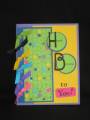
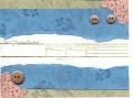
Hmmm, I like the background; however, the stamp in the center just doesn't do it for me.
My suggestion: Put 'You're Invited' very large in the center using a different stamp and/or a script alphabet set then place only the Date, Time, Place part of the stamp on the lower 1/5 of the card. This way the focal point will be on the 'You're Invited'. Maybe even emboss it for some elegance. A suggestion for the corner brackets is to bring them in closer and hold a picture of the couple or person that the party is for.
Just some brainstorming.
------------------------------ *~Tricia~* SU! Demo + Mom to two boys
Thanks Tricia. This is a toughie. I feel like I'm in the ugly card contest! LOL I REALLY want to do a file folder type invitation, but can't imagine doing 30 of them for a swap.
It's a very elegant layout and color scheme, but unfortunately the main purpose (an invitation) is lost as the info stamp is simply too small. It only takes up about a quarter of the card's surface area. I would definitely try to rework this as a different type of card because the Baroque-style images and the colors are wonderful!
Tricia's idea for enlarging the center image is probably one to latch onto. I was trying to figure out how to make it the focus while still keeping the general look of your beautiful design -- how about changing the orientation from horizontal to vertical? By trimming the top and bottom bands down to 4.25" and moving them farther apart, you have created more space for the vanilla strip where the info is located, and made it the central feature of the card! Does this make sense?
------------------------------ Rachel Proud SU! demo and Sci-Fi Geek!
My Stampin' Up! blog "I'm a time traveler -- I point and laugh at archaeologists." 10th Doctor, "Silence in the Library"
Registered: April 9, 2004 Location: Portland , Oregon Posts: 20660
Wed, Aug 10, 2005 @ 2:43 AM
The layout is really good and I love the corner elements and the colors are awesome .I think there may be just a bit too much going on in the background design you are creating , I would try just one image repeated for the background Pieces , the one that looks most like the corner pieces on the lighter color and maybe the fleur de les(sp) on the darker color and see what you think , I think that would give it more of an elegant feel . It would also create a smooth scan accross the card , instead of your eye darting here an there to see all the different images. I also would space the darker pieces just slightly further apart . Not sure the ribbon really works on this , although it is very pretty !
Just a few of my thoughts , hope it helps . Can't wait to see your finished card !
Registered: July 8, 2004 Location: Arizona Posts: 1538
Sun, Sep 11, 2005 @ 7:21 PM
I think your card is lovely. When I first looked at this set my thought was that the wording was a little small. I can see that my initial evaluation was correct. Since you are trying to work with this set there is little you can do about the size of the writing. Perhaps it would help to stamp, You're Invited seperately with a couple of layers behind it. The word window punch might work really well and then another layer under that or just two narrow strips would make the words stand out. I certainly would not make the card over again.
There is nothing wrong with the invitation, it is very pretty, so if you are pleased with it just leave it as it is.


 If I had to change something, I think I would remove the bording blue card stock and leave the rest the way it is. Great work.