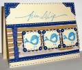
I started off with a totally different piece, planning to combine the two, but ended up setting the other aside and going in a completely different direction from my original plans. My DD suggested a backdrop the color of my sponge, which was somewhere between blush blossom and apricot appeal, so that's how I chose that color to go with my blues.
The flowers and butterflies are stamped with stazon and sponged with tempting turquoise and ballet blue, cut out and then the edges are sponged with brilliant blue. I added some white dots in the centers of the flowers.
Date: Saturday, July 18, 2009 GMT Views: 530
Favorited:7
Registered: October 18, 2008 Location: Arizona-It's a DRY heat! Posts: 4510
Sat, Jul 18, 2009 @ 11:15 AM
The shading on your flowers and butterflies is gorgeous! The background color just makes the blue pop right off the page. Soooo beautiful!!! TFS!
------------------------------ Anne
Live Well, Laugh Often, Love Much The early bird might get the worm, but I would rather sleep late and eat chocolate!
Registered: August 21, 2007 Location: Wayland MA Posts: 105272
Sat, Jul 18, 2009 @ 12:12 PM
These colors are wonderful together! I love the bright blue for the flowers and butterflies!!
------------------------------ Anne HarmonFS154, QFTD58, PROUD FAN CLUB MEMBER (photo of our Great Granddaughter Elise, just 6 months old) and me, even older.