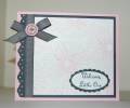
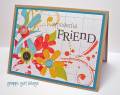
I feel like this is too plain, but wanted to keep the feel of the inspiration picture. It took everything I had not to add something to the top of the white space! What do you think? This is REALLY out of my comfort zone!! LOL!
TFL!
Date: Monday, July 13, 2009 GMT Views: 927
Favorited:14
Registered: July 25, 2007 Location: Sterilite Country, Ma. Posts: 1166
Mon, Jul 13, 2009 @ 4:38 PM
Very creative to use the flower instead of the cat. It captures the feeling of the poster to a "T".
------------------------------ Beth: Yesterday is history. Tomorrow is a mystery. Today is God's gift, that's why it's called the present.
My Gallery CAS Summer 2011,2012,2014 Challenge - Guest Designer
Registered: April 26, 2009 Location: Cutchogue, NY Posts: 578
Mon, Jul 13, 2009 @ 4:41 PM
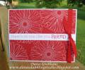
I love this. I clicked on the gallery view and my whole page was filled with thumbnails of cards and I noticed this one first! It is so pretty and definately not too clean and simple....it is simply perfect!
Yorkshire Tea Mingler Creative Crew SU Design Team Alumni
Registered: April 7, 2007 Location: Drinking Yorkshire Tea in Minglerville, MI Posts: 52702
Mon, Jul 13, 2009 @ 5:46 PM
There's no such thing as too CAS ... this is the true definition of Clean and Simple ... really it is ... you need to embrace the white. Well done for not filling in the space. IT'S FABULOUS.
Registered: June 23, 2004 Location: Silverdale, Washington Posts: 1716
Mon, Jul 13, 2009 @ 7:23 PM
I love the color you used and the shyness of your flower. Too cool. Fabulous job.
------------------------------ Charlee
My SU website - http://charleeg.stampinup.net
Live in the moment and make it so beautiful it's worth remembering.