For Colour Challenge CC226 - Baja Breeze, Tempting Turquoise, Apricot Appeal, and Creamy Caramel. I used colours as close as I had.
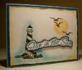
So my idea was to create a card reminiscent of a post card - you know the ones with a pretty scene and then some location or phrase superimposed over top? Well this is what I came up with - looked much better in my head LOL. But you can't love them all can you?!
Sponged apricot appeal for sun and stamped Inkadinkadoo birds and lighthouse. Distresed and sponged edges of cardstock and added a bit of turquoise ink around the lighthouse and along bottom of card. Layered on Pacific Point and Baja Breeze. Sentiment is stamped and embossed and then layered on apricot cardstock and Pacific Point and then popped up for dimension.
Thanks for taking a peek!
Date: Wednesday, July 8, 2009 GMT Views: 642
Favorited:4
Registered: September 12, 2007 Location: Wake Forest, NC Posts: 61357
Wed, Jul 08, 2009 @ 8:04 PM
Laurie, this is such a beautiful card. You've pullede together those colors so wonderfully well. Love the scene and your coloring/sponging is way out of my league!. Exquisite.
------------------------------
Art Neko and Prickley Pear DTs
Former DT Dolce Designs, Rubbernecker, StampItCrazy,
I Brake For Stamps
DO U KNOW?
BRAK members love to send SCSers cards on their birthdays? Come join us.
"Do not go where the path may lead; go instead where there
is no path and leave a trail." ... Ralph Waldo Emerson
Registered: February 26, 2007 Location: On SCS Posts: 36622
Thu, Jul 09, 2009 @ 9:04 AM
LOVE this card!
------------------------------ Kim in Illinois, Dirty Dozen Alum, QFTD#207, FS798, VSN Moderator "Famous Last Words" Spring Virtual Stamp Night, April 19 & 20