Registered: October 9, 2003 Location: Eaton Rapids, Michigan Posts: 1282
Sat, Jan 07, 2006 @ 5:38 PM
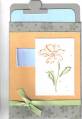
Honesty thread - Hmmmm. Maybe 1" or so of horizontal crimping across the center of the card. Maybe it's just me, but the cocoa piece looks out of place, like it just doesn't go with the card. Maybe remove that layer and replace it with a cluster of the vellum flowers.
Registered: September 25, 2004 Location: Ellicott City, Maryland Posts: 4450
Sat, Jan 07, 2006 @ 11:24 PM
Honesty thread: I really like this. I agree that the cocoa is not great here. I would mount the main image on the base color of NQN and center it more, then add a twill ribbon with the vellum and brad at the knot. Great card though.
Registered: May 2, 2004 Location: Far, far away Posts: 24216
Sun, Jan 08, 2006 @ 1:12 AM
Honesty thread - this is a great card, but I agree about the cocoa looking a bit out of place. I love the idea of crimping halfway up - that would look fab! I would mount the artichoke layer on some cream to make it stand out more. How about moving the Vellum daisy so that it's just to the bottom right corner of the greeting so that it just very slightly covers the edge of the greeting. You might have to stamp the greeting slightly further in to accommodate this.
Registered: February 23, 2005 Location: Red Sox Nation Posts: 12105
Sun, Jan 08, 2006 @ 11:20 AM
Honesty thread: I like the main flower and the artichoke background with the leaves. I agree that the cocoa piece doesn't do anything for me. I think a background something (maybe crimping like others suggesting) might be a nice touch. I like the vellum daisy. I think hemeynell's suggestion to move it to the bottom right corner would be great!
------------------------------ Debbi - SU Demonstrator My SU Website
Visit me on Facebook
Proud Fan Club Member Creative Crew SU Design Team Alumni
Registered: March 3, 2005 Location: Meredosia Illinois Posts: 14612
Mon, Jan 09, 2006 @ 12:22 AM
the card is very well put together, the only thing I would change would be the chocolate CS and I would do away with the extra flower. I think it takes away from the stamped one.
Registered: August 21, 2005 Location: Beautiful New England Posts: 1145
Fri, Jan 13, 2006 @ 1:05 AM
honesty thread: I really like this one! My first thought was that there is alot of space in the upper right corner, but I can't think what to do to help it--maybe a BG stamp? Canvas fixes everything right?