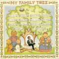
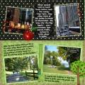
This is for the Stark Contrast challenge. I tried to show the contrast between New York City and what most of the rest of the state is like. It also qualifies for JennÂ’s tree challenge. For me, this was the toughest digi-challenge yet. I had an idea, but had trouble creating it on my page. But, as they say, whatÂ’s done is done!
Credits:
-Spirit of Summer Charity Collab for Australian Bushfire Appeal
find kit here: http://digilovers-addiction.blogspot...-surprise.html
(I used elements in the kit from Neparko of Desert Designs, CRK and Flergs)
-Black Dotty-Anna Russell
-Gem-Bohemian Art (www.scrapartist.com)
-Apple-searched google images
Thanks for looking!
Date: Friday, April 17, 2009 GMT Views: 853
Favorited:3
Registered: October 23, 2006 Location: Indiana Posts: 1928
Sat, Apr 18, 2009 @ 3:44 PM
Wow, what a wonderful layout idea!! I am one of those people who think of NY like that! I love your layout, the colors and pictures are perfect!
------------------------------ April - My Gallery With enough caffeine, I could rule the world!! August Scrappin Goal 10/10 YTD 73/125 September 5/10 Pounds Lost 48/80 Out of my rut!!!